How can CRA: Canada.ca –the official website of the Government of Canada simplify online tax filing for taxpayers?
Project Overview
Timeline
May 2022, 4 weeks
Team
Anita Thang, Ishita Sawant, Victoria Walton, Sydneigh Vitlen
Deliverables
Conducted User Research Conducted User Interviews Constructed Personas Designed Wireframes Built a Prototype Delivered a Design Brief
My Role
User Research, Prototyping, UX Design
Background
As an immigrant in Canada, I learnt that filing taxes can become a tiring process. My team developed a one-stop solution for taxpayers in Canada.
Aim
To improve the taxpayers' experience, thereby encouraging them to use the many services and resources offered by Canada.ca.
We followed Lean UX with an Agile mindset to promote collaborative work and reduce wastes, utilised resources properly, moreover regular discussions, proper collaboration and iterations helped in getting better results in less time. Testing was done at every stage of the process to make sure that the project never went out of track.
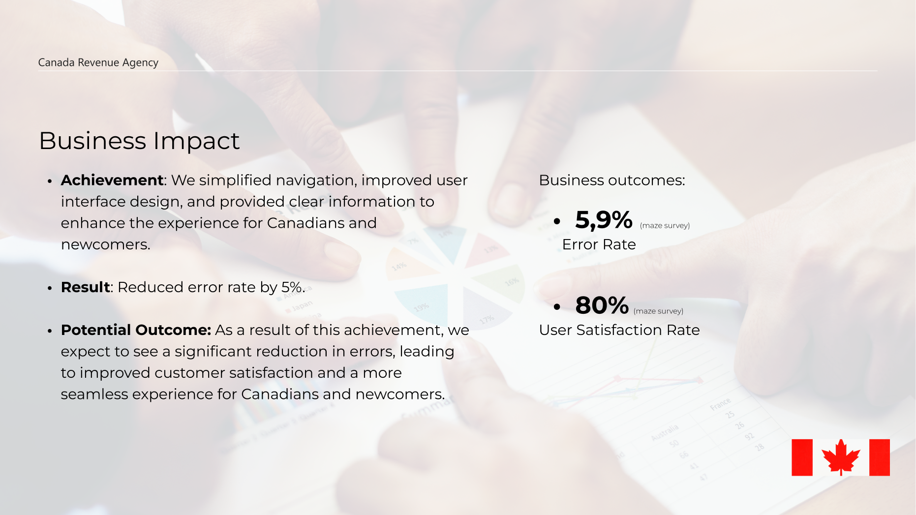
One-stop solution provides quality services for taxpayers
All Canadians & newcomers have to file their taxes. Unfortunately, the CRA’s website makes it a difficult task because of the poor UI design. There is an overwhelming amount of information resulting in difficult navigation through the site.
The Potential Solution
To improve user flow and users’ experience, and make it easier for newcomers to file personal taxes.
As we were starting out we needed to make sure that we understood the scope of the project, as such a white paper research provided us with all the essential information to make educated decisions in regards to our designs. We learnt that just a few short years ago, technology has changed the bookkeeping and accounting services, promoting their most appealing service - one-stop tax filing.(1)Two of us team members had faced this issue personally. Hence, tax clinics have gained a massive popularity over the CRA services. Indeed, a one-stop e-filing has become a number one choice for Canadians and newcomers, which prompted us to redesign the web-page accordingly. (1) -source: cpethink.com
Our Research Questions
How do you currently file your taxes? Why do you use the CRA website? Are you able to look for personal income tax forms easily on the website? If you were to file your taxes through the CRA website, how would you go about doing it?
To answer the research questions, I invite you to see our usability notes
Keep the research questions in mind while I guide you through the ideation process.
“It takes me hours to find the right form!”
User Interviewee
100% Success Rate of Our Behavioural UX KPIs
1 attempt to complete 2 tasks: Sign in & Download personal income tax forms Locate the click to action buttons in under 5 sec. Successfully file personal income taxes in under 3 mins.
Ideation
As we were generating design ideas for the new CRA webpage, we kept in mind the needs of our proto-persona - an immigrant from the USA, who as a newcomer is not familiar with the Canadian tax-filing system. Meet our proto-persona: Amanda Smith!
User Goals
As an immigrant, Amanda wants to learn what personal income tax forms she needs to file. She then needs to sign in to her CRA account. Finally she needs to select personal income tax forms.
Keep the research questions in mind while I guide you through the ideation process.
As mentioned above, a one-stop e-filing is a simply more attractive solution for many taxpayers, particularly immigrants.The white paper research (see above) prompted us to ask the following question: Why is CRA underperforming if compared with tax clinics? As we implemented UI design analysis to focus on the user goals, and the tasks they perform to achieve their goals, we learnt that our proto-persona has to take 8 steps to learn how to file personal income taxes on CRA
Proto-persona: Amanda Smith
User Path
Step 1 Go to canada.ca and click on - Income Tax Step 2 Click on - Personal income tax Step 3 Click on - Who should file a tax return Step 4 Click on - Newcomers to Canada Step 5 Click on - Which income tax package should you use? Step 6 Click on income tax package Step 7 Click on - Ontario Step 8 Select the form you need
CRA Style Guide
We then asked ourselves how we could improve the user journey, and as we were putting a mood board together for lo-fi design ideas we focused on the style guide and the heuristic analysis of the CRA webpage to identify our users’ most frequent pain points. Why were the mood board, style guide and heuristic analysis done simultaneously? Considering the time constraint, we felt that we could meet the deadlines better if we paired up in smaller teams.
We identified 6 principal pain points for the user while conducting the evaluation. E.g.: content organisation (see below). For more information, please click here. As we were moving on with our project, we wanted to focus on optimising the CRA website design & navigation with the help of intuitive information architecture. Bad information architecture is something we needed to avoid at all costs. As it confuses and annoys the user, making them leave the page which then causes a significant decrease of conversions. In order to make CRA information architecture intuitive and user-friendly we had to take a look at it from the user’s point of view. We felt that the best way to do that would be through a card sorting method .For more information please click on the hyperlink.
Key Findings
As somebody who loves staying in the francophone part of Canada, I wanted to learn the difference between filing taxes in Quebec and Ontario. Surprisingly, I discovered that quebec.ca has a minimalist homepage layout with one-stop solutions and easy-to-spot accessibility features. Hence, my competitor analysis reinforced my desire to move to Quebec! As we were conducting usability testing, our participants voiced the need to have a search bar with filters to narrow down their search scope and most importantly to make CRA meet all of the requirements of policies that reference The Web Content Accessibility Guidelines.
1) The CRA website uses error codes whenever issues occur, which have little meaning to users. 2) The website doesn’t take the user to the CRA homepage when clicking on the logo. 3) The CRA website layout is very content-dense + bad organisation. This makes it difficult to remember where certain things are. 4) The CRA website does not offer any option to bookmark the page nor create shortcuts 5) CRA informs users of errors via error messages. This is not helpful. They should state a problem and provide a solution. 6) CRA provides live chat features in case the user has a problem with the website. However the website does not have a help page and FAQ.
Wireframes
As part of the design process, we ventured into understanding the web content accessibility guidelines, as our target users may have special needs. Subsequently, we understood that due to the time constraint we could meet only two requirements: colour blind colour palette, speech-to-text chatbot.
After usability testing, we quickly realised that our paper sketches needed some improvement. Our participants reported low satisfaction and multi-level concerns with a horizontal accordion. This feedback prompted us to switch to a vertical accordion. Our low fidelity wireframes were updated accordingly. Finally, It begs a question: How did the stages above improve our wireframes? This question was essential to understand the effectiveness of our design process. Thankfully, our participants were very insightful about their experiences when it comes to filing taxes. Thus, we included their requests in our MVP matrix and created a list of Behavioural UX KPIs. To prove the effectiveness of our KPIs I invite you to go through the redesigned screens.
Behavioural UX KPIs
1 attempt to complete 2 tasks: Sign in & Download personal income tax forms Locate the click to action buttons in under 5 seconds Successfully file personal income taxes in under 3 minutes
Home Screen Minimalist layout design. Hi-Fi Desktop Prototype
100% success rate of our Behavioural UX KPIs
1 attempt to complete 2 tasks: Sign in & Download personal income tax forms Locate the click to action buttons in under 5 sec. Successfully file personal income taxes in under 3 min.
“I no longer need to spend hours figuring out what tax forms I need!”
User Interviewee
Deliverables
Lastly, we conducted our final usability testing using Usabilityhub. Our participants reported high satisfaction with the final product and requested an Android prototype.
Finished Deliverables
Hi-Fi Mobile and Desktop prototypes designed using the colour blind safe palette A/B testing –testing out two different landing pages
Unfinished Deliverables
We had no time left to develop a speech–to-text chatbot in Adobe XD
What’s next?
If we had more time
We would have definitely incorporated the comments from above to create an even better experience. Furthermore, we would want to track metrics such as income tax and log in clicks. Other ways to measure success include: More usability testing: at which points are the users leaving More user feedback: what are users’ behaviours and opinions? Traffic analysis: how are the users interacting with the new CRA layout? A/B testing: is our chosen UI design pattern effective in increasing users’ likelihood to complete their goals successfully?
Lessons learnt
The most important lesson was to introduce the participants early on. Thankfully, we managed to recruit 7 participants from different backgrounds. Additionally, time management played a paramount role in our design process. We relied on Asana to track our progress, however we failed at developing a speech-to-text chatbot


.png)

%20Free%20On%20123movies.net%20-%20123moviess.net.png)


.png)